The Good News Hunter
A good news brand for Newcastle and the Hunter, built on Instagram and on one promise. No clickbait, just good news. The website needed to look like it meant it.
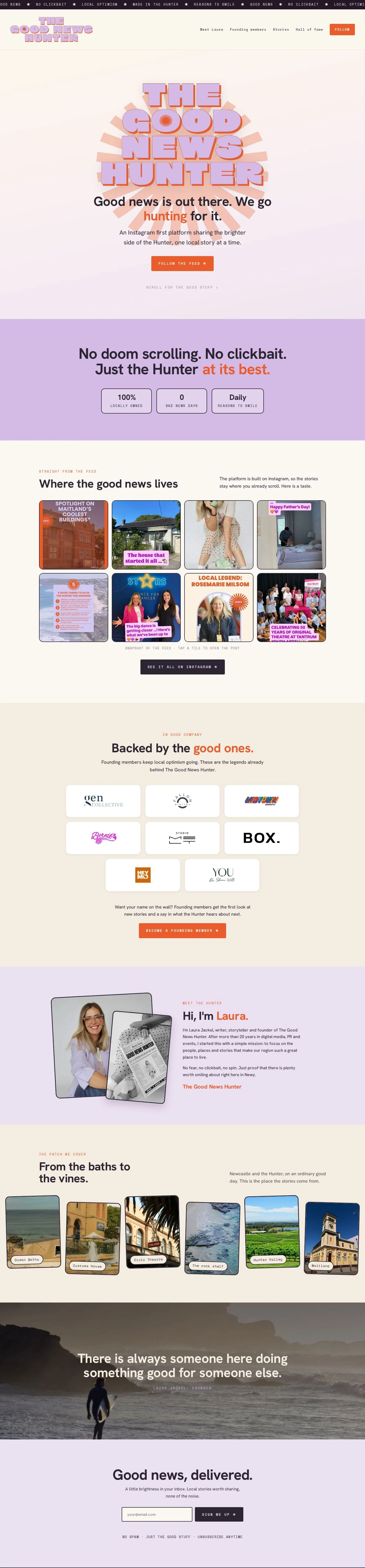
A website for a brand that lives on Instagram.
Laura Jackel started The Good News Hunter to share the people, places and quiet good deeds that make the Hunter a good place to live. The stories are told on Instagram, and that is where the audience already is.
So the website had a narrower job than most. It needed to make the brand credible at a glance, send people to the feed and the newsletter, and give local businesses a reason to back it as founding members. It also had to stay on the website builder the brand was already using.
- Website design and build, on the platform the brand already used
- Seven pages: Home, Meet Laura, Stories, the Hall of Fame and three long read stories
- A newsletter sign up that captures every address, in place of a box marked coming soon
- A founding members wall, with the invitation to join sitting right underneath it
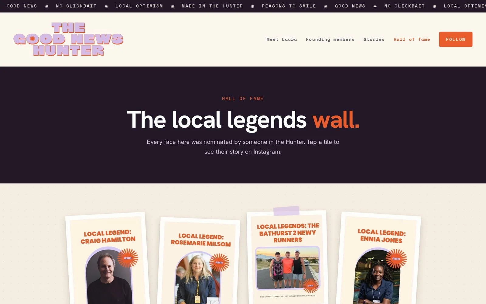
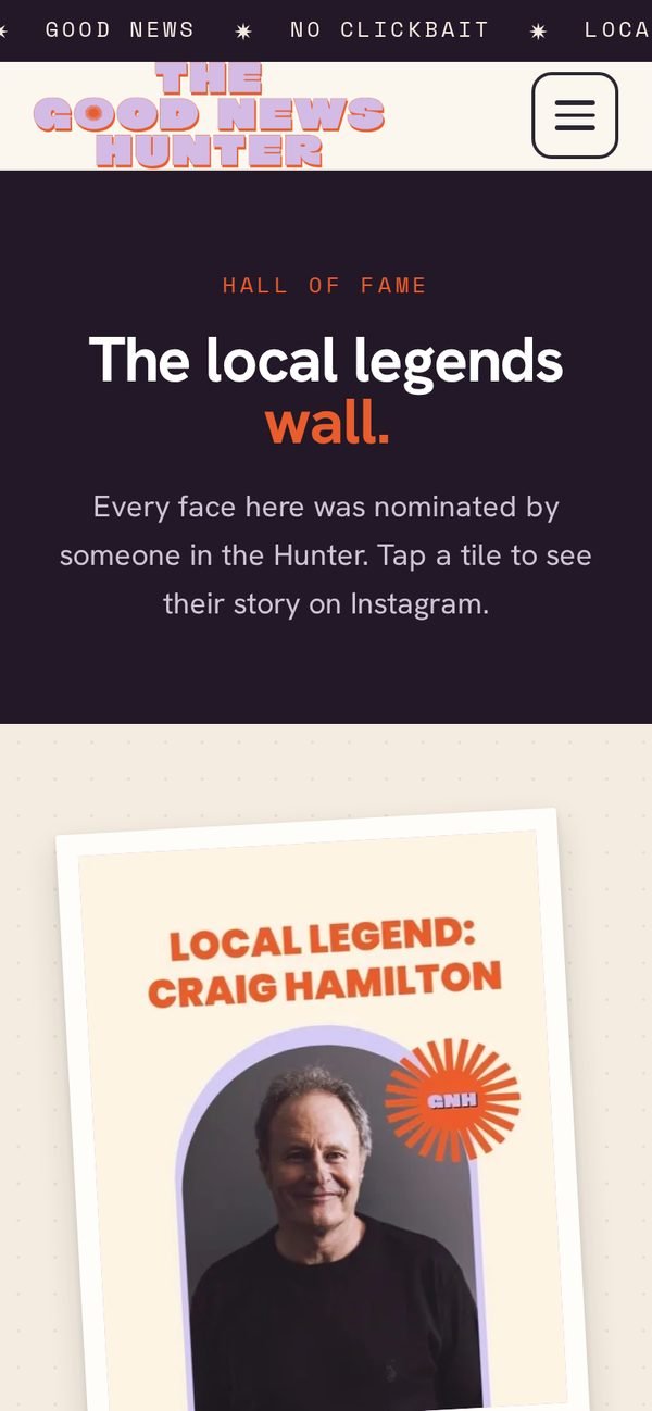
- A Hall of Fame of local legends, each tile opening their story or their Instagram post
- Custom code throughout, so no page looks like a template
From a default template to a front page.
Drag across the homepage to compare. The same brand and the same wordmark, with a very different first impression.
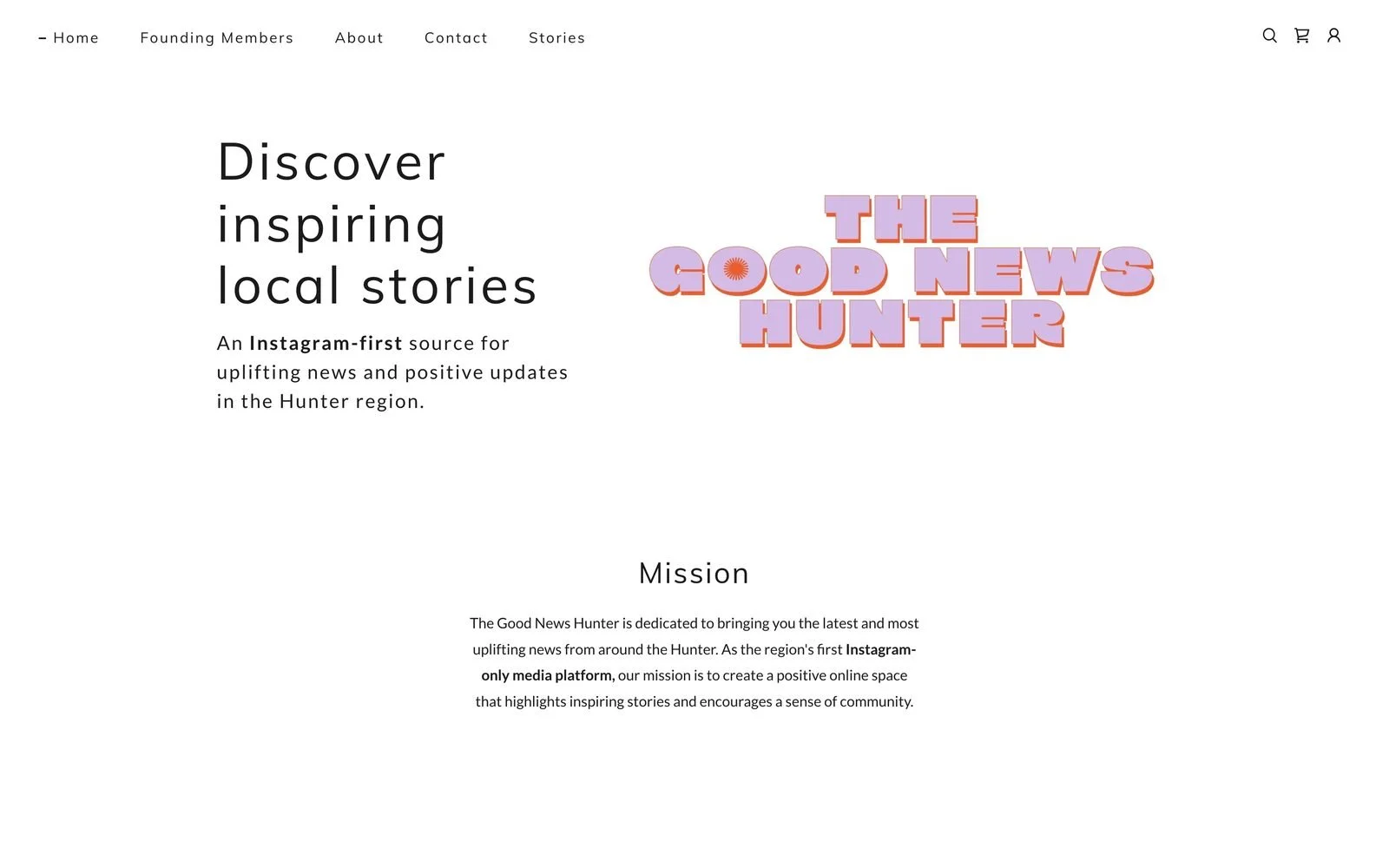 Before
After
Before
After
A default template. A mission statement, a lone sunburst, a newsletter box marked coming soon and an empty shop section left over from setup.
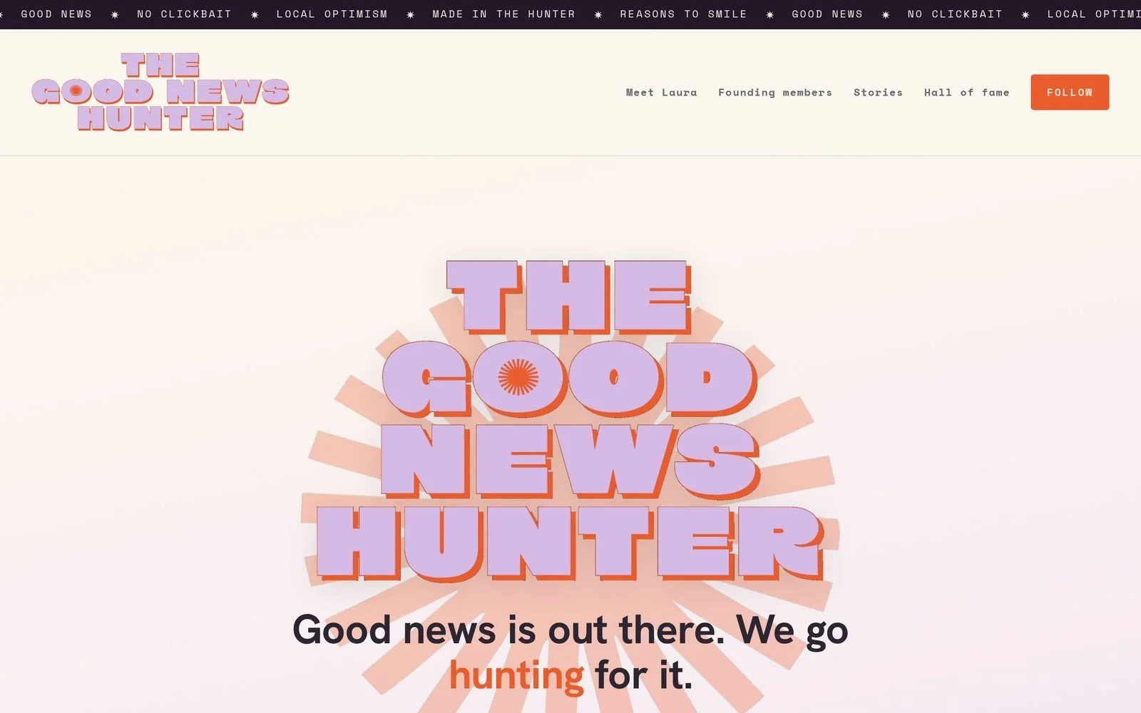
The wordmark as a masthead on a soft sunrise, the feed at the heart of the page, a newsletter that works and the founding members up front.
Four decisions worth defending.
Underneath the colour, the site has three ways out. Follow the feed, join the newsletter or become a founding member. Every page leads to at least one of them.
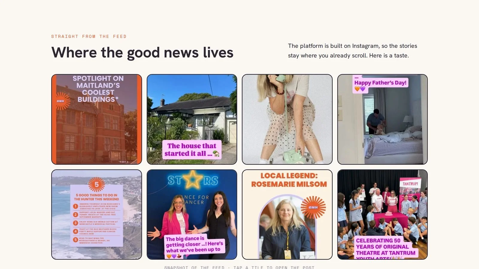
The site does not compete with the feed. The heart of the homepage is a snapshot of it, every tile opens the real post, and a Follow button sits in the top corner of every page.
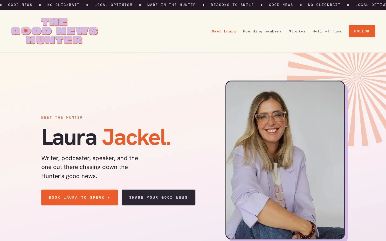
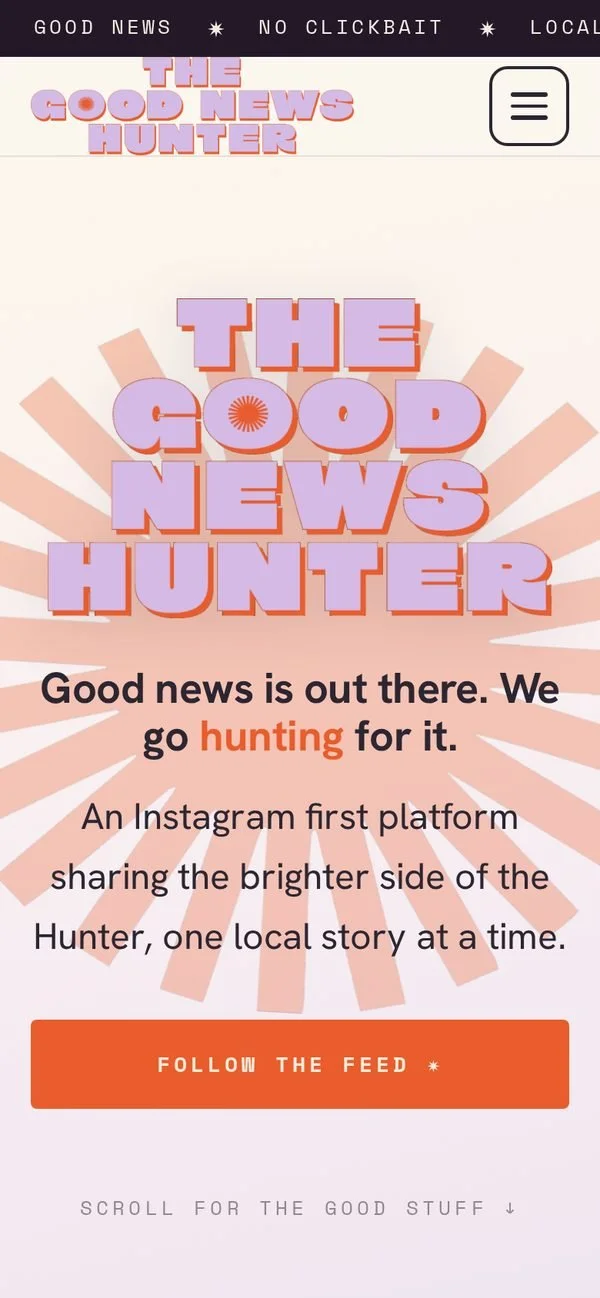
The homepage opens on a soft sunrise of cream and lilac, so it reads as good news rising rather than breaking news. Lilac, plum, cream and orange then carry through every page.
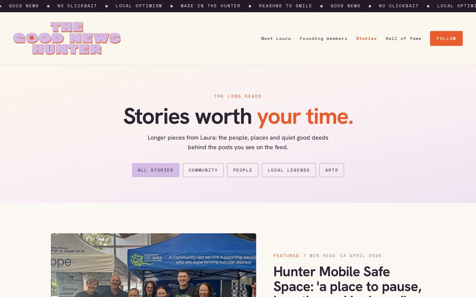
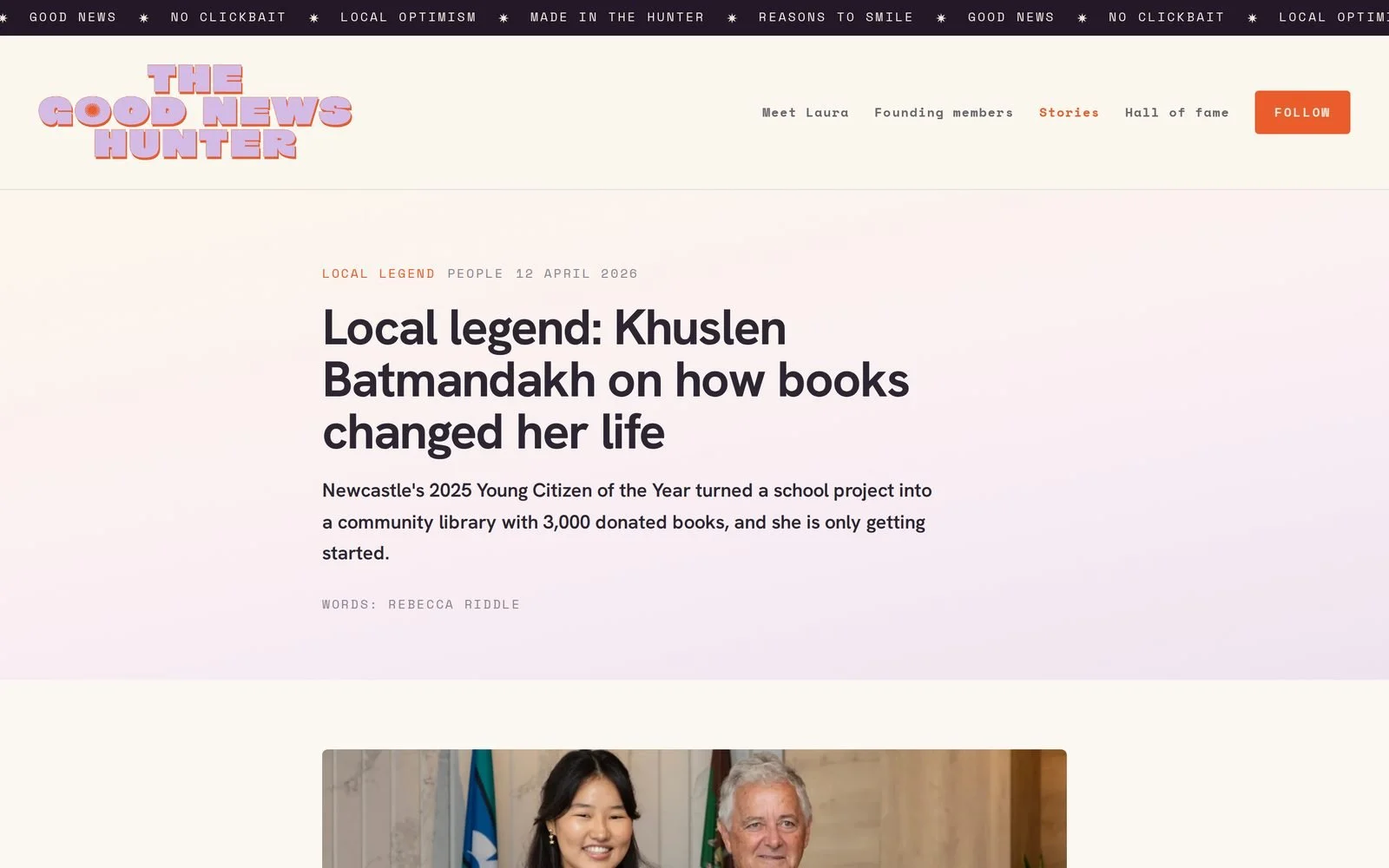
The chunky wordmark sits at the top like the masthead of a local paper. Small newsroom details carry the personality, from the ticker of local optimism to the typewriter stamps.
Founding members keep the lights on, so their logos sit on the homepage under "Backed by the good ones", with the invitation to join directly below. The wall is proof and pitch at once.
Seven pages, one voice.
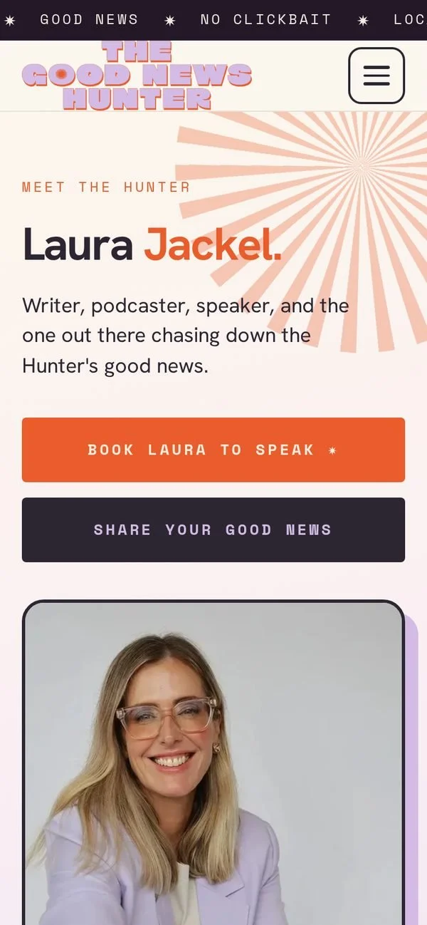
Meet Laura, the long reads and the Hall of Fame each have their own job, and every one of them feels like the feed.
Past what the template allows.
The brand was staying on its website builder, and that builder lets you choose a colour scheme and a font pairing and not much else. So every page was designed and coded from scratch, then placed inside the builder's custom code blocks.
A small script clears away the template's own header, footer and spacing around each page, and makes the links behave as if the site had been built from the ground up. The newsletter form is custom too, but it hands every sign up to the builder's own mailing list, so nothing changes about how Laura sends her emails.
Stuck with a website builder?
You might not need to move. The Good News Hunter never changed platform. It changed what the platform was asked to do.